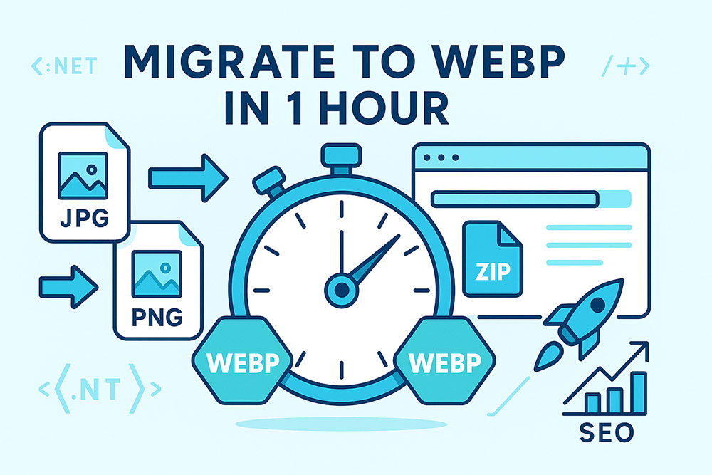
Need a fast, repeatable way to cut image weight and improve page speed? This guide shows you how to convert JPG/PNG/JPEG to WebP in bulk, update markup the right way for SEO, and verify real world improvements—all in under an hour. We’ll use the free Image to WebP tools at iKozmik, including a page crawler that finds non-WebP images, converts them, and gives you a ZIP with the same folder structure.
Why Migrate Site Images to WebP?
- Faster pages = better SEO: WebP files are typically 30–70% smaller than JPEG/PNG at similar visual quality, which reduces Largest Contentful Paint (LCP) and improves Core Web Vitals.
- Broad support in 2025: Chrome, Safari, Firefox, Edge, and Android all support WebP. It’s the practical default for the open web.
- Transparency & quality: WebP supports alpha (transparency) and both lossy and lossless modes. PNG-style crispness or JPEG-style compression—your choice.
- Easy to automate: With a crawler and REST API, you can migrate once, then bake WebP into your build or deploy process.
What You’ll Do (60-Minute Plan)
- Pick a page or template to migrate (home, category, article).
- Crawl and bulk convert non-WebP images to WebP; download a ZIP with preserved folders.
- Swap your markup to WebP-first using
<picture>, with a JPEG/PNG fallback.
- Set responsive delivery with
srcset/sizes and cache headers.
- Validate with Lighthouse/PageSpeed; confirm LCP and byte weight improvements.
- Roll out across other templates or automate via CI/CD.
Step 1 — Choose a High-Impact Target
Start where improvements will be most visible:
- Homepage hero (LCP image is often here)
- Category/PLP pages with lots of thumbnails
- Article template with inline images
Grab one URL per template and tackle them one by one. You’ll build confidence quickly.
Step 2 — Bulk Convert Non-WebP Images (Crawler → ZIP)
Use the Convert Website Images to WebP tool to scan a page and convert every image that isn’t already .webp. The ZIP preserves relative folders so it drops back into your project neatly.
Recommended settings
- Format: WebP
- Quality: 80 for photos; use Lossless for logos/UI and screenshots
- Depth: 1 (start simple); increase if the template includes internal links to image-heavy sections
- Same host only: On, to avoid external domains
The crawler automatically skips images already in .webp and converts JPG/JPEG/PNG/GIF. You’ll see progress as images are found and converted, then you’ll download one ZIP.
Step 3 — Replace Markup with WebP-First Delivery
Your HTML should prefer WebP while keeping a safe fallback. The simplest pattern:
<picture>
  <source type="image/webp" srcset="/img/hero-1200.webp 1200w, /img/hero-800.webp 800w"
          sizes="(min-width: 900px) 1200px, 800px">
  <img src="/img/hero-1200.jpg" alt="Hero image" width="1200" height="675">
</picture>
- WebP first: Modern browsers pick it; others use the JPEG/PNG fallback.
- Responsive: Include
srcset widths (e.g., 800w/1200w) and a sizes rule.
- Dimensions: Add
width/height to reduce CLS.
Thumbnails / Grid Images
<picture>
  <source type="image/webp"
          srcset="/img/card-320.webp 320w, /img/card-480.webp 480w, /img/card-640.webp 640w"
          sizes="(min-width: 1100px) 320px, 50vw">
  <img src="/img/card-480.jpg" alt="Card image" width="480" height="360">
</picture>
Make sure your converted WebP files follow the same naming scheme so swapping URLs is straightforward. The crawler’s ZIP helps by preserving the **same folders and base names** (just the extension changes).
Step 4 — Caching, Headers, and Friendly Downloads
- Cache aggressively: Static image assets should have long
Cache-Control (e.g., public, max-age=31536000, immutable) with fingerprinted names or versioned paths.
- Content-Type: Ensure
image/webp is served for WebP files.
- Content-Disposition (download flows): If offering downloads, keep human-friendly names:
Content-Type: image/webp
Content-Disposition: attachment; filename="My Product Photo.webp";
  filename*=UTF-8''My%20Product%20Photo.webp
Nginx (optional) — serve WebP when available
map $http_accept $webp_suffix {
  default "";
  "~*image/webp" ".webp";
}

location ~* ^/img/(.+)\.(png|jpg|jpeg)$ {
  try_files /img/$1.$2$webp_suffix /img/$1.$2 =404;
  add_header Vary Accept;
}
This pattern tries .webp for browsers that accept it, otherwise serves the original.
Step 5 — Validate with Lighthouse & PageSpeed Insights
- Run Lighthouse or PageSpeed before changes; note LCP and Total Byte Weight.
- Deploy the WebP changes for your chosen page/template.
- Re-run Lighthouse/PageSpeed; compare the metrics. You should see reduced transferred bytes and often better LCP.
- Use RUM (e.g., GA4) to confirm improvements for real users (p75/p95).
Once you confirm gains, replicate the process on the next template—category pages, product detail pages, then long-form articles.
Optional — CI/CD Automation (for teams and large sites)
If you deploy regularly, bake WebP into the pipeline:
- On commit or build: resize to needed breakpoints → encode WebP variants → upload to CDN.
- Only re-encode changed originals (hashing or mtime checks).
- Write tests: ensure
<picture> ordering, type="image/webp", width/height, and sensible sizes.
Prefer a WebP-first strategy with a fallback. For maximum savings, also consider AVIF as an additional <source> once you’re stable with WebP.
Quality Settings That Work (Recap)
Photos
- Lossy Quality 80 (try 75–85).
- Resize large sources (e.g., max 1920px wide).
- Strip metadata for public delivery.
Logos & UI
- Lossless by default.
- If needed, Lossy 90–95 with visual check.
- Transparency preserved.
Thumbnails
- Resize to render size (e.g., 320–600px).
- Lossy 70–80 works well.
Transparent Assets
- Soft edges: Lossy 85–90.
- Crisp UI: Lossless.
Mistakes to Avoid
- Converting everything lossless: Photos balloon in size; use Lossy for photography.
- Skipping responsive delivery: Serving a 2000px hero to a 360px screen wastes bytes. Add
srcset/sizes.
- No fallback: Always keep a JPEG/PNG fallback for legacy integrations and edge cases.
- Ignoring dimensions: Add
width/height to prevent layout shifts.
- No measurement: Validate with Lighthouse/PageSpeed and RUM; let the data guide you.
One-Hour Migration Checklist
- Pick a high-impact page or template (home/category/article).
- Run the Page → WebP converter; download the ZIP (folders preserved).
- Replace URLs or drop files into your project path.
- Switch markup to
<picture> with WebP <source> first and JPEG/PNG fallback.
- Add
srcset/sizes, width/height, and proper cache headers.
- Test visuals at 100–200% zoom; tweak quality where needed.
- Run Lighthouse/PageSpeed; compare LCP and transferred bytes.
- Roll out to the next template; consider CI/CD automation.
FAQs
Does migrating to WebP help SEO?
Indirectly, yes. Smaller images improve render speed and Core Web Vitals (especially LCP), which search engines use as ranking signals. Faster pages also convert better.
Will PNG transparency survive?
Yes. WebP supports transparency in both lossy and lossless modes. Use lossless for crisp UI, lossy for photo-like edges.
What quality should I use for photos?
Start with 80. For galleries with consistent backgrounds, 75 can look identical while saving more. For critical visuals (faces, architecture), push 85–90.
Do I need a fallback?
It’s best practice. Use <picture> with a WebP <source> plus a JPEG/PNG fallback <img>. Modern browsers will choose WebP automatically.
Can I convert an entire site?
Yes—start with key templates. Use the crawler to convert a page (or section) at a time.
Wrap-Up: Ship Faster Pages Today
Migrating a website’s images to WebP is one of the fastest ways to boost performance without a redesign. With a simple crawler, responsive markup, and a quick validation loop, you can land meaningful gains in under an hour. Repeat the process across your templates, then automate it in CI/CD so every deploy ships optimized assets.
 Quick & Easy On-Page SEO changes that will double your traffic